BRANDING

Logo for strategy department
S&T Department Values:
It is seen as a beacon to STG A/S future. It is set to explore, dare, challenge, support, investigate, learn and shape the knowledge into strategic guidelines. S&T is curios, knowledgeable, ready to go extra mile and never giving up.
Target Audience:
Business key stakeholders. Inside (different teams that are to be supported but also challenged by S&T) and Outside (all partners tseeking for proof of STG A/S determination to tackle business challenges in the most profound way).


 |  |  |
|---|---|---|
 |  |



Fashion&Friends Values:
Fashion&Friends brings well-known fashion brands closer to local markets through carefully curated retail spaces and a recognizable customer experience. Our role in the creative process is to support and reflect that experience — through the design of seasonal materials that align with brand spirit while meeting everyday practical needs. We value simplicity, functionality, and visual consistency.
Target Audience:
Internally, teams represent the brands through daily customer interactions and a consistent, professional look. Externally, every detail — from gift bags to seasonal wrapping — reflects care for aesthetics and brand experience.


Olya minic cakes
Olya Mini Cakes is a small-batch, online patisserie dedicated to preserving the charm of traditional desserts. Every piece is made with care, inspired by time-honored recipes and a love for handmade quality. Our visuals reflect that same warmth — blending simplicity, tradition, and a personal touch.
Our task was to design everything from the logo to the full branding, including visuals for the website, creating a seamless experience that mirrors the quality and authenticity of the desserts themselves.
Target Audience:
Customers who seek authenticity and care in every bite, those who appreciate tradition, the taste of homemade delicacies, and want to enjoy desserts that evoke nostalgia, whether for special occasions or everyday moments of indulgence.


SOCIAL MEDIA
PACKAGING & LABELS


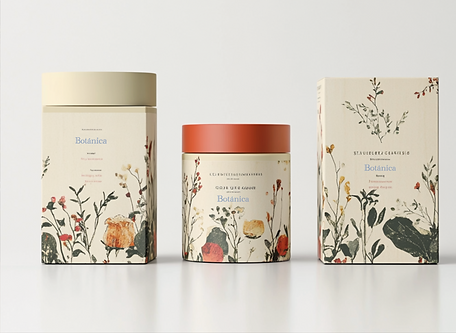
Botanica Skincare
Botanica is a celebration of nature — a rustic, floral-inspired skincare line rooted in simplicity, purity, and timeless rituals. From the beginning, the vision was clear: to craft a brand that feels like stepping into a wild garden, where every product carries the essence of real, unfiltered beauty.
The design reflects this spirit. Hand-drawn botanical elements, earthy tones, and textured materials create an organic, tactile experience. Every label, every box, is made to feel personal — like something lovingly passed down, not mass-produced.
Target Audience:
Nature-loving individuals who value clean ingredients, honest craftsmanship, and skincare that feels both grounding and beautiful.



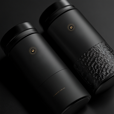
Dsefire is the essence of quiet luxury — a premium coffee brand where every detail is intentional, from bean to design. Boldly minimal, wrapped in deep black with gold foil accents, Velour speaks to those who appreciate elegance in restraint.
The visual identity is striking yet subtle: a matte-black canvas with a gold-pressed logo that catches the light like the aroma of a perfect roast. No noise, no clutter — just a refined presence that mirrors the depth and clarity of the coffee itself.
Target Audience:
Modern aesthetes and refined coffee lovers who value exceptional quality, elevated rituals, and design that feels as rich as the experience in every cup.




Gondola Wine Label Design
Gondola is more than a name — it’s a symbol of quiet journeys, timeless elegance, and stories carried through the years. Inspired by the graceful motion of a gondola on still waters.
The original label was simple and classic; our redesign brings added richness, detail, and a touch of mystery.
We developed a new identity that feels both traditional and refined, where every element — from the logo to the label textures — reflects the wine’s layered character. The result is a bottle that tells a deeper story, made to be savored with the same care as the wine itself.
Target Audience:
Those who appreciate subtle luxury, who seek stories in the details, and who value the quiet sophistication of a wine that speak softly but leave a lasting impression.




WEB DESIGN & PRESENTATIONS


Bifrost Website & Logo Design
Bifrost is a brand built for the harshest elements, where winter’s power meets refined design. Inspired by the rugged strength of Norse heritage and the chill of the northern landscape, we crafted a logo that embodies both the resilience and beauty of cold climates.
The logo features bold lines and angular shapes, drawing on Viking motifs and the fierce, untamed nature of winter. Combined with the sleek, modern website design, the result is a digital experience that feels both raw and sophisticated. High-contrast visuals, dynamic typography, and seamless navigation put the brand’s performance-driven gear at the forefront.
Target Audience:
Outdoor adventurers, athletes, and explorers who demand gear that reflects both strength and style — backed by a brand inspired by the enduring power of winter and Nordic tradition.


PRESENTATIONS DESIGN


